

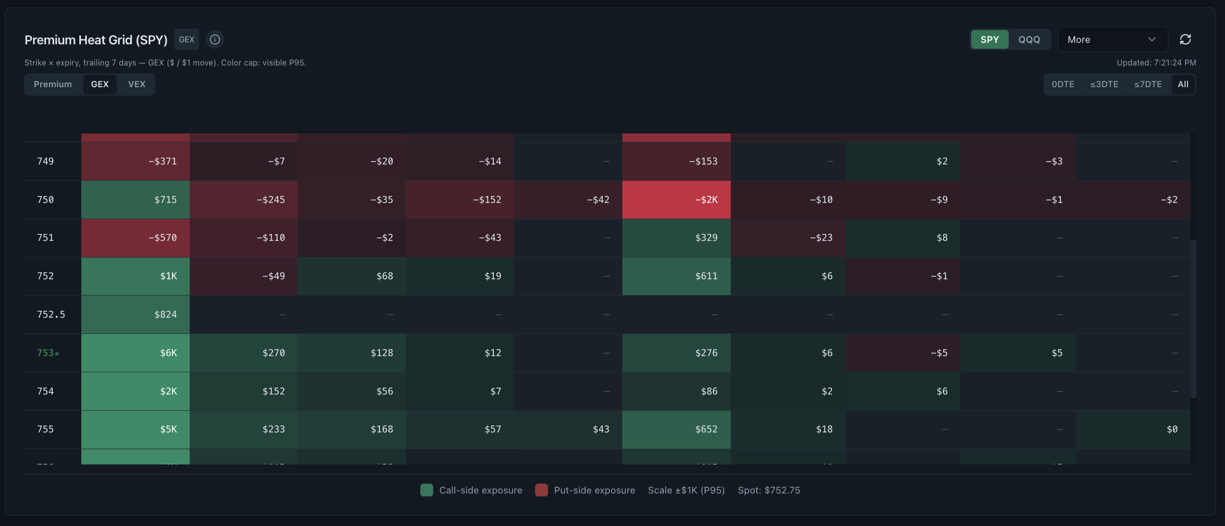
Premium Heat Grid dashboard
The Premium Heat Grid maps call and put premium, gamma exposure and vanna exposure across strike and expiry. It turns a long option chain into a visual concentration map, helping researchers see whether activity clusters near spot, on one expiry or across several maturities.
- Research question
- Which strike and expiry carries the exposure?
- Best used for
- Finding concentration across the option chain
- Data timing
- Near-real-time Pro; 15-minute delayed trial
- Product access
- Included in the single $29/month plan
What the premium heat grid dashboard shows
A heat grid is useful because concentration is difficult to see in a conventional chain table. The same data becomes easier to compare across calls, puts, strikes and expiries when magnitude is encoded consistently in a two-dimensional layout.
Read the supporting context
The screenshot above is from the working product, not a mockup. The visible controls and fields are the same ones trial and Pro users research with; only the market-data timing changes between the two access levels.
- Call-side and put-side cells arranged by strike and expiration.
- Premium mode for where money changed hands.
- GEX mode for estimated gamma exposure around each strike.
- VEX mode for estimated sensitivity to volatility changes.
How to read this dashboard
Read the dashboard as one step in a sequence. Record what it directly shows first, then use the next view to test the interpretation rather than turning a color or ranking into a conclusion.
- Locate the underlying price and identify the nearest strike cluster.
- Compare calls and puts within the same expiry before comparing maturities.
- Switch from premium to GEX or VEX to separate traded money from exposure mechanics.
- Open the open-interest view to see whether fresh activity sits on existing positions.
What this view cannot establish
A bright cell shows concentration, not intent. Large premium may belong to one leg of a spread, and exposure estimates depend on pricing inputs that change through the session.
Read the supporting context
Realtime Options organises observed and derived market data for independent research. Read each view with its stated method, assumptions and surrounding context.
Common questions
What is an options premium heatmap?
It is a visual matrix that groups premium or derived exposure by strike and expiry. Stronger cells indicate larger values, making concentration easier to see than in a row-by-row chain.
Does the heat grid include 0DTE options?
Yes. The expiry axis can begin with same-day contracts and continue through later cycles, allowing 0DTE concentration to be compared with longer-dated activity.
Is a high-premium strike support or resistance?
Not by itself. Premium concentration needs direction, open interest, dealer-exposure estimates, price behavior and time to expiration before it can support a market-structure hypothesis.