

Options Volume Change scanner
The Options Volume Change scanner ranks symbols whose classified options activity changed most within the selected comparison window. It creates a market-wide research queue showing where activity shifted and where a closer review may be useful.
- Research question
- Where did classified options volume change most?
- Best used for
- Market-wide watchlist discovery
- Data timing
- Near-real-time Pro; 15-minute delayed trial
- Product access
- Included in the single $29/month plan
What the options volume change scanner shows
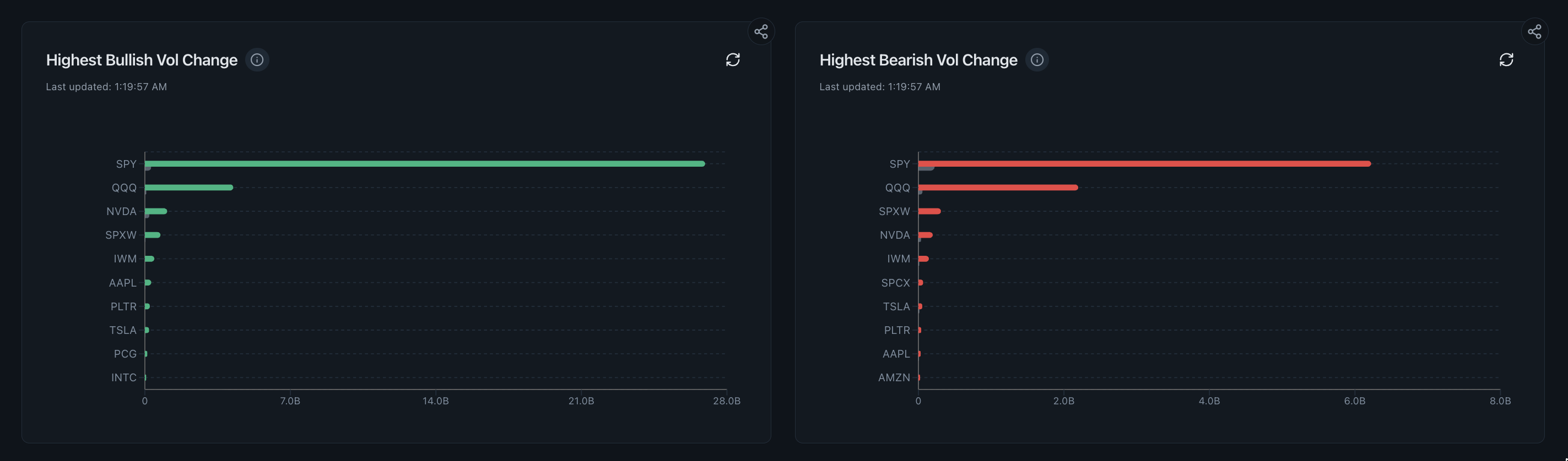
The paired rankings are designed for prioritisation. A large bar means the model found a large change in classified volume relative to the comparison basis; it does not explain why that change occurred or whether the activity belongs to one directional position.
Read the supporting context
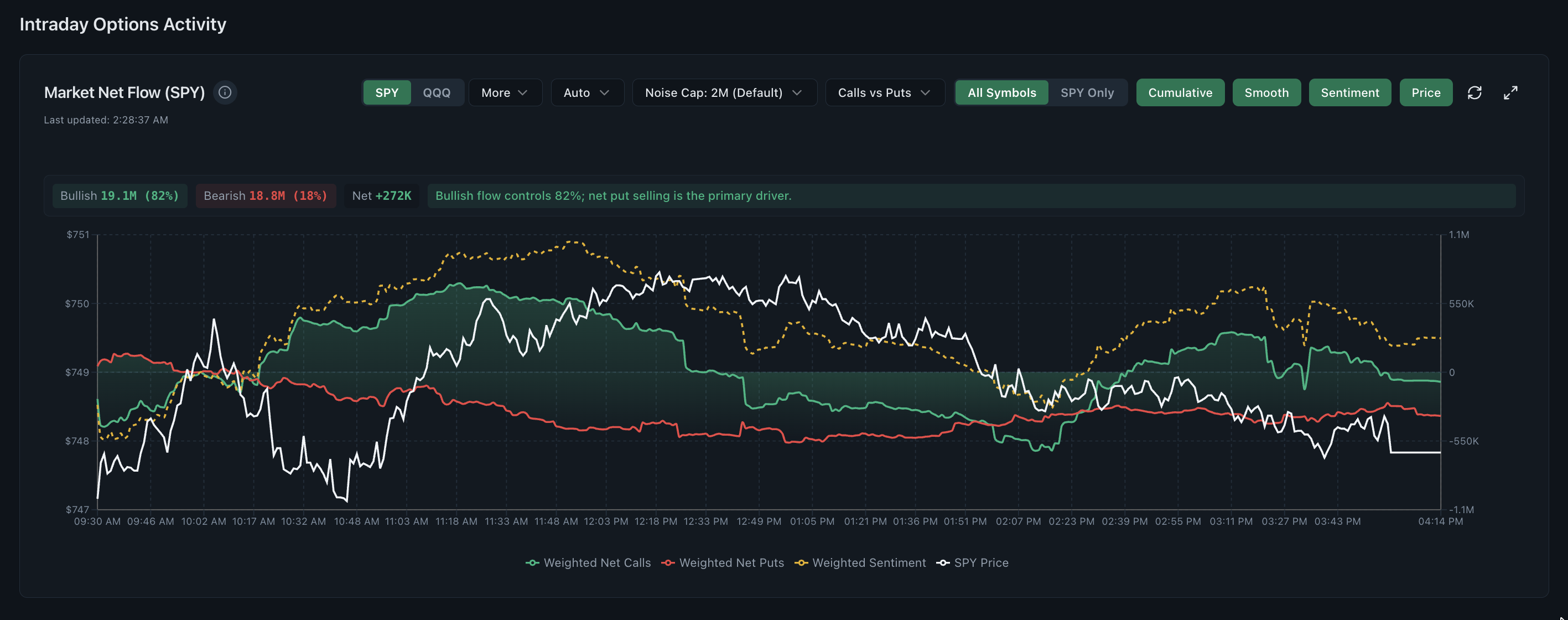
The screenshot above is from the working product, not a mockup. The visible controls and fields are the same ones trial and Pro users research with; only the market-data timing changes between the two access levels.
- Separate model-classified volume-change rankings.
- Ticker-level bars for comparing relative concentration at a glance.
- A visible refresh time so the observation window is not mistaken for live-now evidence.
How to read this dashboard
Read the dashboard as one step in a sequence. Record what it directly shows first, then use the next view to test the interpretation rather than turning a color or ranking into a conclusion.
- Confirm the selected window and refresh time before comparing symbols.
- Note the first few names in each category rather than focusing only on the longest bar.
- Open the ticker-level flow, price and option-chain views for each candidate.
- Check whether a scheduled event, index exposure or one large contract explains the change.
What this view cannot establish
Options volume includes opening, closing, spread, hedge and roll activity. Each directional category remains an estimate derived from public execution evidence.
Read the supporting context
Realtime Options organises observed and derived market data for independent research. Read each view with its stated method, assumptions and surrounding context.
Common questions
What does the options volume-change scanner rank?
It ranks symbols by the change in model-classified options activity during the selected window, creating an ordered list for further research.
How should I use the top-ranked ticker?
Open its price, premium, strike, expiry, open-interest and news views before forming a conclusion from the ranking.
Why show both directional categories together?
The two lists preserve market breadth and conflicting activity. Looking at only one side can make a mixed session appear more directional than it is.