

Sector options flow dashboard
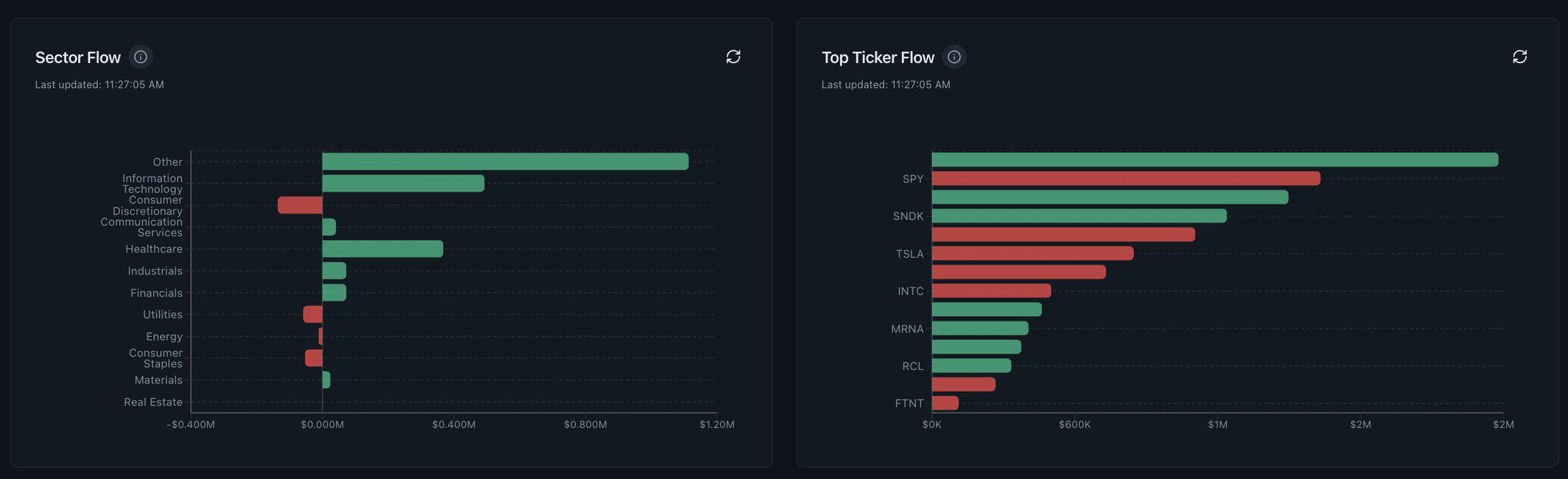
A sector options flow dashboard groups call- and put-side activity across market sectors, then ranks the individual tickers contributing to each group. Use it as a breadth and prioritization view: compare several related names, price behavior, strikes and expiries before describing what the concentration may represent.
- Research question
- Which sectors and names contain the most classified options activity?
- Best used for
- Turning a market-wide read into a focused watchlist
- Data timing
- Near-real-time Pro; 15-minute delayed trial
- Product access
- Included in the single $29/month plan
What the sector options flow dashboard shows
Sector grouping provides context that a ticker leaderboard cannot. A large single-name print is easier to describe when several related names and the sector ETF show similar activity, and easier to isolate when the rest of the group is quiet.
Read the supporting context
The screenshot above is from the working product, not a mockup. The visible controls and fields are the same ones trial and Pro users research with; only the market-data timing changes between the two access levels.
- Sector-level breadth and premium comparison.
- Top tickers ranked by positive and negative premium classifications.
- Separate call- and put-side context for rapid comparison.
- ETF and single-name activity inside the same narrowing workflow.
How to read this dashboard
Read the dashboard as one step in a sequence. Record what it directly shows first, then use the next view to test the interpretation rather than turning a color or ranking into a conclusion.
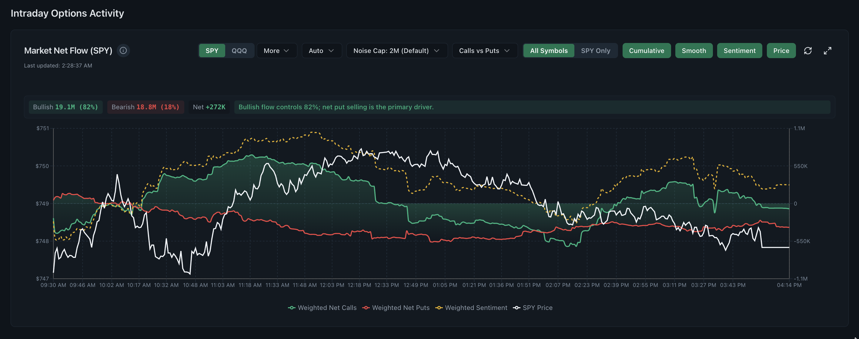
- Compare sector breadth with the market-wide activity shown by Weighted Net Flow.
- Choose names that repeat across sector and ticker rankings, not one isolated bar.
- Compare the ranked premium with underlying price rather than treating either one alone as confirmation.
- Open the flow map and heat grid to locate strikes and expiries.
What this view cannot establish
Rankings are relative snapshots and can be dominated by liquid large-cap names. They do not normalize every difference in market capitalization, event calendar or typical options volume.
Read the supporting context
Realtime Options organises observed and derived market data for independent research. Read each view with its stated method, assumptions and surrounding context.
Common questions
What is sector options flow?
It is the aggregation of classified call and put activity across companies or ETFs in the same market sector, used to compare where premium is concentrating.
Why rank tickers by options premium?
Premium reflects the amount paid for contracts and can be more informative than contract count alone, especially when tickers have very different option prices.
Is the top-ranked sector ticker a recommendation?
No. It is the highest ranked result under the current analytic rules. It still requires strike, expiry, price, open-interest and catalyst checks.