

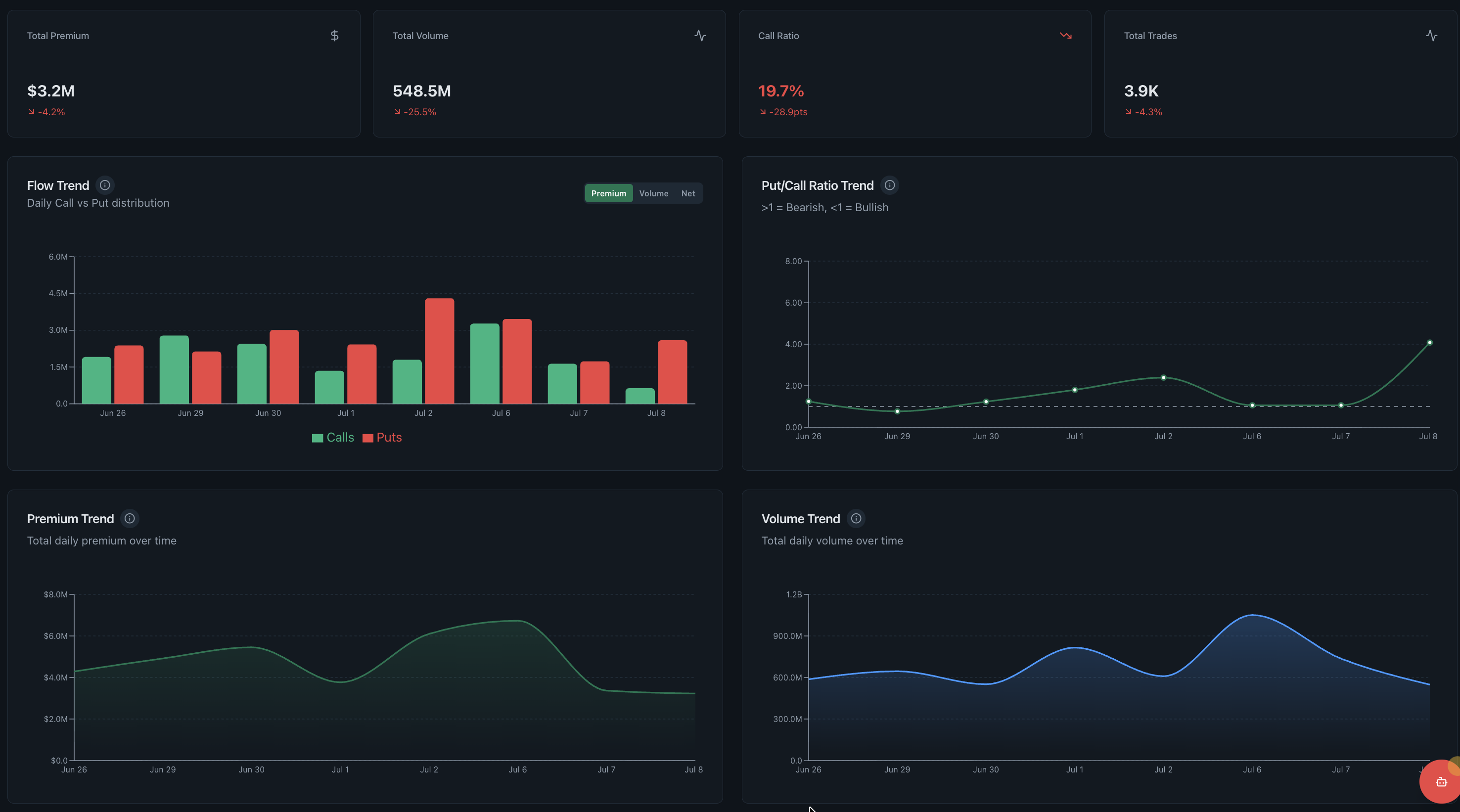
Flow Trend dashboard
The Flow Trend dashboard tracks options premium, volume, put/call ratio and trade count across time. Its purpose is comparison: determine whether the current session differs from recent activity and which measure changed, rather than judging a single day by an absolute number.
- Research question
- Is today unusual or part of a broader trend?
- Best used for
- Historical comparison across several flow measures
- Data timing
- Near-real-time Pro; 15-minute delayed trial
- Product access
- Included in the single $29/month plan
What the flow trend dashboard shows
Trend views reduce the availability bias created by the newest alert. Showing several measures together also reveals whether a premium spike came with broader volume and participation or only one large transaction.
Read the supporting context
The screenshot above is from the working product, not a mockup. The visible controls and fields are the same ones trial and Pro users research with; only the market-data timing changes between the two access levels.
- Total and directional options premium across sessions.
- Contract volume with a comparable time window.
- Put/call ratio history rather than one point in time.
- Trade count for distinguishing blocks from broad participation.
How to read this dashboard
Read the dashboard as one step in a sequence. Record what it directly shows first, then use the next view to test the interpretation rather than turning a color or ranking into a conclusion.
- Choose a consistent lookback window before judging whether a session is unusual.
- Compare premium with volume to identify expensive versus numerous contracts.
- Check trade count for breadth and put/call ratio for directional balance.
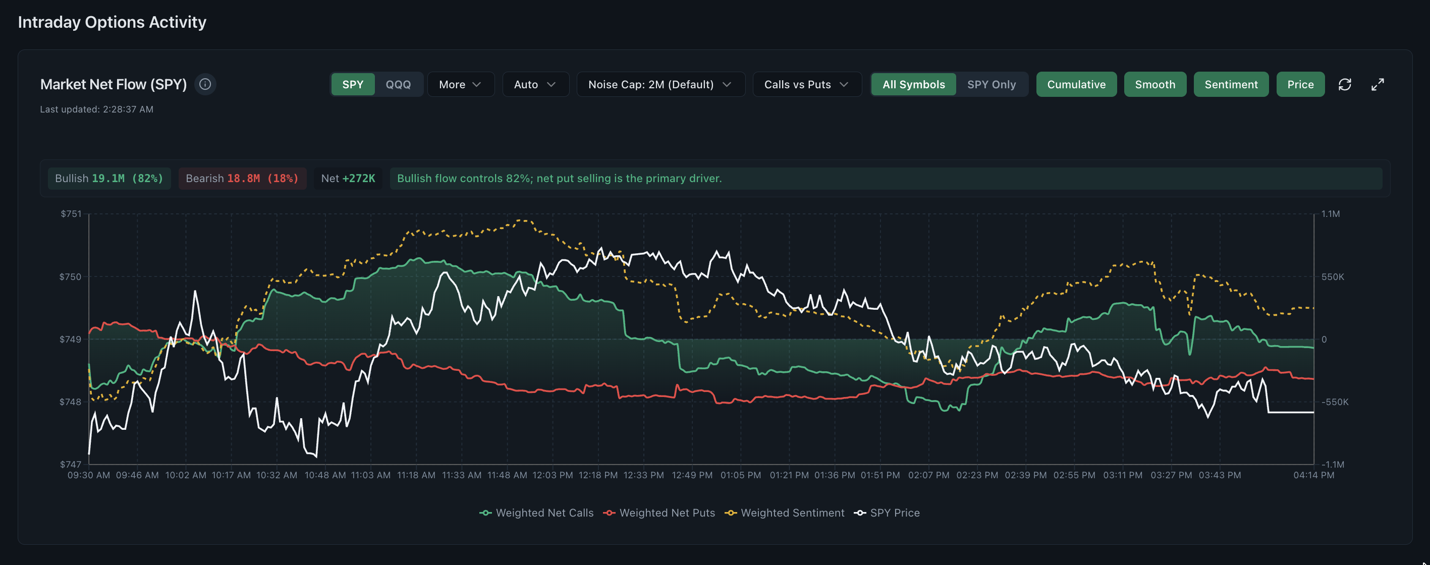
- Return to the intraday chart to locate when the historical outlier developed.
What this view cannot establish
A recurring historical pattern is descriptive, not causal. Changes in volatility, event calendars, market regimes and contract mix can make visually similar periods behave differently.
Read the supporting context
Realtime Options organises observed and derived market data for independent research. Read each view with its stated method, assumptions and surrounding context.
Common questions
What is an options flow trend?
It is the change in measures such as premium, volume, put/call ratio and trade count across a chosen series of sessions.
Why track premium and volume separately?
Volume counts contracts while premium reflects their prices. A high-volume day in cheap contracts can carry less money than a lower-volume day in expensive contracts.
Do historical flow patterns predict returns?
No. Historical comparison can generate research questions, but changing conditions prevent a past visual pattern from guaranteeing a future outcome.